Sunday, May 2, 2010

Definition of Design

From Chapter 1
DESIGN: TO DESIGN INDEED MEANS TO PLAN, TO ORGANIZE.

"Materials are lifeless until given shape by a creator" (Lauer, Pentak).

Thursday, April 29, 2010

Earth Day Art

Cobbett Elementary School Earth Day Tree Collage
Earth Day 2010


Synesthetic Photo

"Love Affair"
Regina Spektor

Wordle Post

Wordle: Good Design

Illusion of Motion in Art

Optical Illusion in Art


Thursday, April 8, 2010

Jun Kaneko


Environmental Issue Animation- Pollution

Group Project idea

My idea was to do a poster about one general topic- like the environment for example, but we each focus on a different issue. I presented this in class.

Wednesday, March 24, 2010

Lines of Emotion

Joyful
Agitated


Types of Lines

Implied Line
Actual Line


Sunday, March 21, 2010

Pantone

"My new fashion rule is to embrace colors that make you feel good and breathe new life into your closet. Now more than ever is the time to mix new colorful accessories with your classic silhouettes. You'll be amazed at what a splash of color can do to both your 'look' and your 'outlook.'"


Cate Adair, costume designer, Desperate Housewives


Monday, March 15, 2010

Music Video: Use of Color

Artist: Justice
Title: DANCE


Emphasis and Focal Point

Focal Point through Contrast
Emphasis By Isolation


Sunday, February 28, 2010

Repetition of Form

Repetition of Form
Revenge of the Goldfish
Sandy Skoglund, 1981

Thursday, February 25, 2010

Grid Work

Loose Grid
Danelle Kay, 2009

Tight Grid


Jan Williams


Tight Grid


Michael Phelps Portrait for the LA Times

Charis Tsevis, 2008


Gestalt Creation


My representation of a Gestalt image


Gestalt

Figure Ground Gestalt Principle

Sunday, February 14, 2010

Exploring Value: High Key, Low Key

This composition can be defined as low key because the values are primarily darks.


This is a high key painting because the values are dominated by lights and has fewer contrasting dark areas.

Thursday, February 11, 2010

Symmetrical Compositions

Symmetry in Nature Composition

Bilateral Symmetry Composition


Friday, February 5, 2010

Value $ and Balance ---

Ross's Landing, Departure Point for the Cherokee on the Trail of Tears

Chattanooga, TN, 2007

Emily Gomez


This photograph is a good example of both value and balance. An example of balance in this photo is the bridge. The brdige is symmetrically balanced. One can easily find the center of the bridge which represents equilibrium. I think this picture is also balanced by value, the bridge is noticeably lighter than the water below it and the sky above it is lighter. The value in this photo gives off a nice progression throughout the entire photograph by drawing your eye in at visual points of interest while the different values gently meet one another. This photograph also shows different examples of both high and low key values, however, overall, this photograph seems to have a medium range of values. The darkest point being the bottom half of the edge of the water at the bottom of the page and the lightest point being the very top of the photograph. Hints of light, dark, and medium values are shown throughout the image such as parts of the bridge, tips of the machinery, buildings int he background, and the shrubery that sits right off the lake. Perhaps the most beautiful part of this photo is the value that happens over the body of water. The ripples that have formed across the water as well as the reflection and shadows from the bridge and the sky atop create different shades of gray across the water. It also creates a glossy effect on the water which plays with the smooth and rippled textures on the water.

Tuesday, February 2, 2010

Andy Goldworthy Public Art

Andy Goldsworthy

Leaves polished, greased made in the shadow of the tree from which they fell, pinned to the ground with thorns.
Le jardin Massey, Tarbes, France,22 August 1989

I really like that he is a nature artist. He seems to like to play around with snail shapes, spheres, lines, and natural curves. I think this is one of my favorite works of art by him because it is very inventive, creative, and original. This entire work or art is made through nature, all the materials are natural and I think that makes for a really pure and beautiful work of art. Accordingly, I am also fond of the process and method he used in creating this artwork. He kept the leaves in their natural habitat, where they fell from the tree and he used thorns that he gathered to keep them in place. It also looks like a giant snail and this piece of art could be used by nature to create a home for themselves, so I think it serves several purposes other than beauty.

Tuesday, January 26, 2010

Mock Public Art Project

I want to create an abstract art piece. Something with mostly smooth, curved lines that is unique and well received. I want my sculpture to convey harmony, peace, and growth. And give the viewer feelings such as happiness, inspiration, and motivation. I am not sure of the location yet however, the two places I have in mind are by Tatnall Square park, or by Washington park.


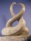
This first image really conveys harmony to me. I can even picture it with the top of the sculpture forming into the shape of a heart. I would like to create something that has structure but is also very soft.


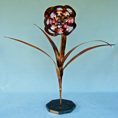
I like the intricate simplicity of this sculpture. It signifies growth and beauty to me and those are also elements I want to incorporate in my sculpture.

Sunday, January 24, 2010

Public Artwork

Scrapture of Liberty
Egg Harbor City, NJ

The Art of Car Repair
This interesting sculpture was made entirely out of scrap parts and metal garbage and it's supposed to resemble the Statue of Liberty. It is fittingly located outside of Peterson's Garage, an auto repair business, and was built by owner, sculptor, and mechanic Tom Peterson in 2007. Unlike the Statue of Liberty in New York, this sculpture is not made out of pure copper and doesn't stand 151 ft tall. This sculpture appears to use a lot of wheels, carts, and sheet metal. This actually could be used as another example of form vs. content. Both statues share similar form but the materials used to make the sculpture are different.

Thursday, January 21, 2010

Form vs. Content

Same Form, Different Content
Czech liquor bench ad, "Get Closer."

IKEA bench ad "A little fabric goes a long way."


Slim Fast bench ad


Kit Kat bench ad

All of these advertisements use a bench in different creative ways to convey a specific message about their product to consumers. The first ad is a liquor advertisement, their slogan is that their alcohol brings people closer so, they designed a bench to do just that. The second ad is for IKEA which showcases a very stylish use of their fabric which can make dingy furniture much more appealing. The third ad is from Slim Fast which is essentially a 'skinny' bench, and the goal of their product to make one lose weight. The last ad is from Kit Kat which makes the bench look like candy by painting it a milk chocolate color and making it look smooth. It's important this bench stays clean so that their product still looks appealing enough to eat.